A six-page company site built with Bricks scored 59 on mobile in PageSpeed Insights. After one working session all six pages score 100 in all four categories, on mobile and on desktop. Below is every step: what was wrong, what we changed, how we checked it, and what the numbers did.
The site is signalizacijasdm.com: WordPress, Bricks with a child theme, a CSS framework plugin, scroll animations driven by GSAP, Google Fonts and four icon libraries. Nothing unusual, which is why it makes a useful example.
Step 1: Move the CSS framework out of its plugin
The site used Automatic.css, which generates its utility classes and design tokens through a plugin. However, the site uses a fraction of them. We wrote that fraction, plus all the tokens, into the child theme’s style.css as 47 KB of plain CSS and deactivated the plugin.
Swapping a framework for a snapshot is risky if you check it by eye. We loaded twelve URLs before and after at five screen widths and compared the computed style of every element and pseudo-element, including hover and focus states. The result was zero differences.
The trade-off is that classes the site did not use no longer exist, and the framework’s panel in the editor is gone until the plugin is switched back on.
Step 2: Measure every page before changing anything else
We ran all six pages through PageSpeed Insights on mobile and desktop and kept the report links. We did the same after every step that follows, because without it you cannot tell which change did what.
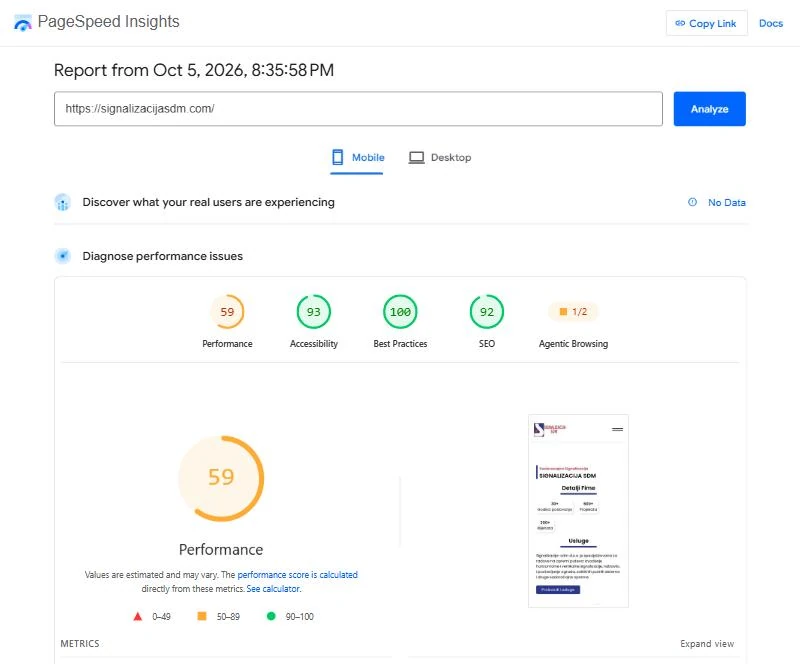
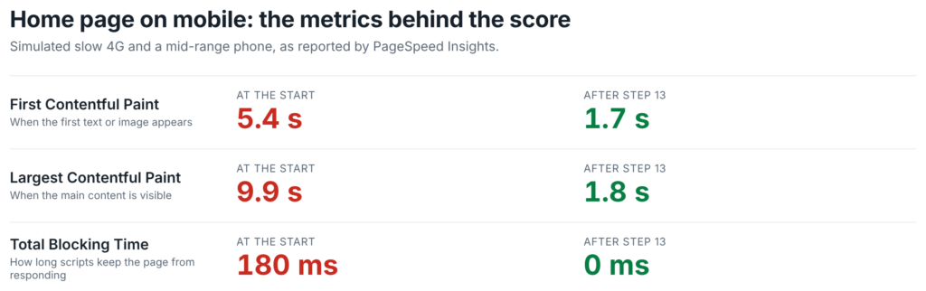
Mobile performance ran from 59 to 91 depending on the page, desktop from 75 to 82. Accessibility sat at 88–94 and SEO at 92 everywhere. On the home page, the simulated phone waited 5.4 seconds for the first paint and 9.9 seconds for the main content.
These numbers were taken after step 1. We have no measurement from before it.
Step 3: One stylesheet per page instead of a dozen
Each page loaded about a dozen separate CSS files. Our caching plugin, DJIA Cache, has a setting called Combined CSS bundle, on its Assets tab, that combines the stylesheets a page uses into a single file named by its content hash. We switched it on and cleared the cache.
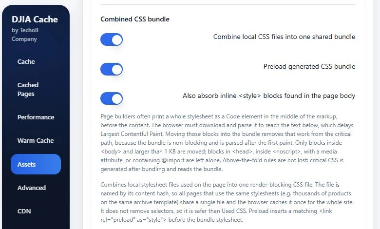
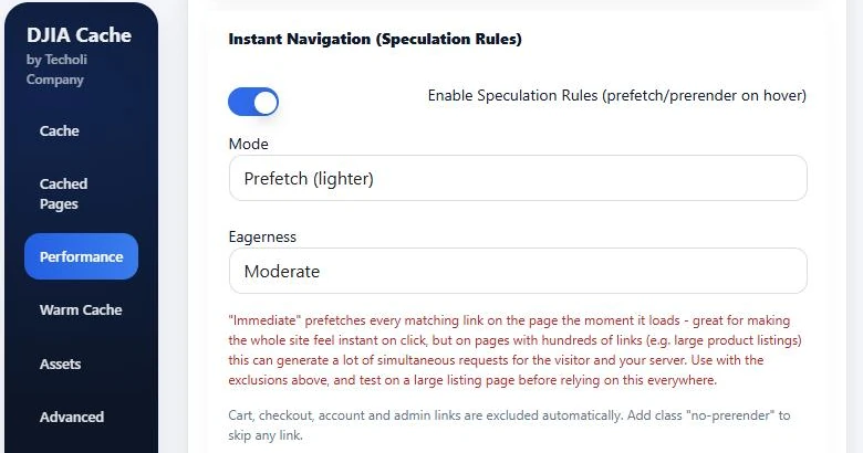
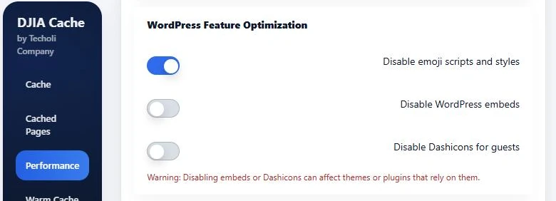
In the same plugin we also switched on Disable emoji scripts and styles and changed the Eagerness of Instant Navigation (Speculation Rules) from Immediate to Moderate, so links are prefetched when a visitor shows intent instead of as soon as the page loads.
As a result, the home page went from 59 to 72 on mobile.
Step 4: Host the fonts on the site
The fonts came from Google’s servers, which costs a connection to a second domain before any text can render in the right typeface.
- We downloaded the twelve font files the site uses (Poppins in four weights plus italic, and Open Sans) and uploaded them to the site.
- We declared them with
@font-facein the child theme, withfont-display: swap. - We stopped WordPress from printing the Google Fonts stylesheet and the connection hints to Google.
- We added preload links for the fonts.
Step 5: Give the fallback font the same measurements
On desktop the home page scored 81 even though it painted in 0.8 seconds. The layout shift score was 0.35, which is poor.
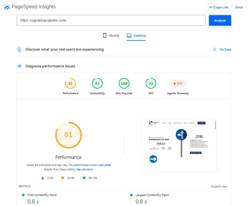
The cause was the main menu. Its font was declared as Poppins with no fallback, so for a moment the browser drew the menu in a wider default font, the menu wrapped onto two lines, and everything below it jumped. A fallback font with adjusted metrics makes the placeholder text occupy the same space as the real one:
@font-face {
  font-family: "Poppins Fallback";
  src: local("Arial"), local("Roboto");
  size-adjust: 112.16%;
  ascent-override: 93.62%;
  descent-override: 31.21%;
  line-gap-override: 8.92%;
}
body { font-family: "Poppins", "Poppins Fallback", sans-serif; }
After that, layout shift on the home page went to zero.
Step 6: Ship fifteen icons, not four icon libraries
The site loaded four icon libraries (two from Font Awesome, plus Ionicons and Themify) to show fifteen icons. So we cut the four fonts down to those fifteen glyphs. Together they weigh 3 KB and travel inside the stylesheet, and the full libraries are no longer loaded. If an editor later adds an icon that is not in the small set, the full library for that icon comes back automatically.
Step 7: Fix what the accessibility audit listed
Accessibility was at 93. The audit listed these:
- Links that contain only an icon or an image (social networks, phone, email, gallery photos) had no name for screen readers. We added an
aria-labelto each. - Headings skipped levels. We corrected the level each heading announces without changing how it looks.
- One number in the hero section did not have enough contrast against its background. We changed its colour.
- The page declared its language as English while the content is Serbian. We set the correct
langattribute.
We made the markup fixes in a small filter in the child theme instead of editing dozens of elements by hand.
Steps 4 to 7 went live together. Afterwards the combined stylesheet was 137 KB instead of 289 KB, the home page scored 98 on mobile and 100 on desktop for performance, and accessibility was at 100.
Step 8: Write the meta descriptions
SEO was at 92. None of the pages had a meta description. We wrote six, one per page, from the content of each page, and entered them in the page settings. SEO then went to 100.
Step 9: Make scripts wait for the visitor
The animations need GSAP, ScrollTrigger and several other scripts. But none of them is needed to draw the page. Scripts now load on the visitor’s first interaction (touch, scroll, key press or mouse movement) or five seconds after the page has loaded, whichever comes first.
The server prints each script with a type the browser does not run. A small loader swaps them back, in their original order, when it is time. This is its core, simplified:
var events = ['pointerdown', 'touchstart', 'keydown', 'wheel', 'scroll', 'mousemove'];
var started = false;

function start() {
  if (started) return;
  started = true;
  loadNext(document.querySelectorAll('script[type="text/delayed"]'), 0);
}

function loadNext(list, i) {
  if (i >= list.length) return;
  var s = document.createElement('script');
  s.async = false;
  s.onload = s.onerror = function () { loadNext(list, i + 1); };
  s.src = list[i].getAttribute('data-src');
  list[i].replaceWith(s);
}

events.forEach(function (name) {
  addEventListener(name, start, { passive: true, capture: true });
});
addEventListener('load', function () { setTimeout(start, 5000); });
Delaying scripts is easy to do badly. Four details decide whether visitors notice:
- If the first thing someone does is tap the menu button or a gallery photo, nothing is listening yet. We catch that click, load the scripts, then replay it.
- Scripts that wait for the page’s “ready” event would wait forever, because that event has already fired. The loader fires it for them.
- Animated elements start invisible and wait for a script to reveal them. Until the scripts arrive, we keep them visible.
- The counters (“30+ years”, “600+ projects”) are printed with their final values in the HTML and no longer sit at zero.
Logged-in users get the scripts the normal way, so the editor works as before.
We checked that no script loads without interaction, that everything runs without errors after the first scroll, that the first tap on the menu opens it, and that the first click on a photo opens the lightbox. Total blocking time on mobile went from 180 ms to 0.
Step 10: Stop phones from downloading images they never show
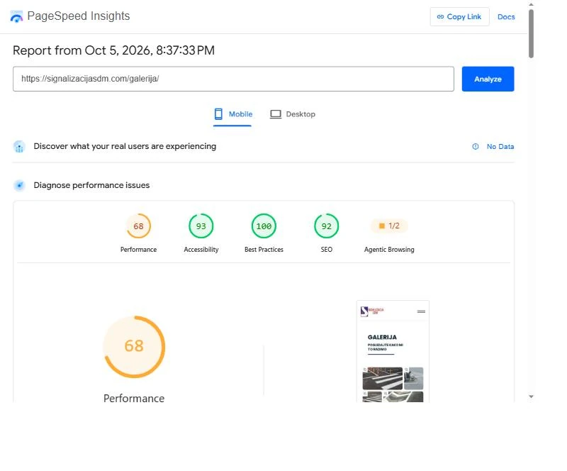
Several pages have separate sections for phones and for larger screens, each hidden on the other. Browsers still download images inside a hidden section unless they are lazy-loaded. On the gallery page, a phone fetched the desktop hero image at high priority while the image the visitor could see waited in the queue.
We read from Bricks which sections are hidden at which breakpoint. An image inside one gets an extra one-pixel candidate, and a sizes value that selects it at the widths where the section is hidden:
<img src="hero.jpg"
     srcset="data:image/gif;base64,R0lGODlhAQABAAAAACH5BAEKAAEALAAAAAABAAEAAAICTAEAOw== 8w,
             hero-768.jpg 768w, hero.jpg 1000w"
     sizes="(max-width: 767px) 1px, 100vw">
On a phone the browser picks the inline pixel and downloads nothing. On a larger screen it picks the real image as before.
The image that is the largest element on each layout now loads first, with loading="eager" and fetchpriority="high". Other images in phone-only sections are lazy-loaded.
We checked at 412 and 1350 pixels that neither layout downloads the other’s images and that the pages look the same once loaded. On the gallery page, mobile LCP dropped from 3.8 to 1.9 seconds and the score rose from 89 to 99.
Step 11: Fix a layout that depended on which images had loaded
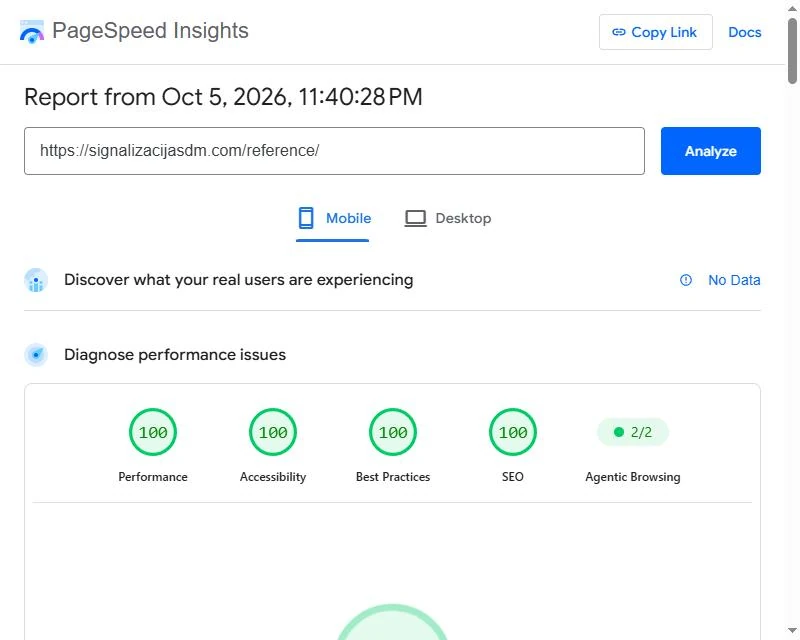
The references page shows partner logos in rows. Each logo was 15% wide, but the row had no width of its own; it took its width from the logos. Every image that finished loading made the row wider, which made every logo bigger, which pushed the next section down. The layout shift score on desktop was 0.46 at the start and still 0.24 after step 9.
Giving the rows an explicit width fixed it:
.logo-row { width: 870px; max-width: 100%; }
.logo-row img { flex-shrink: 0; }
The page looks the same once loaded, and nothing moves on the way there. The references page then went to 100 on mobile and on desktop.
Step 12: Convert the images to WebP
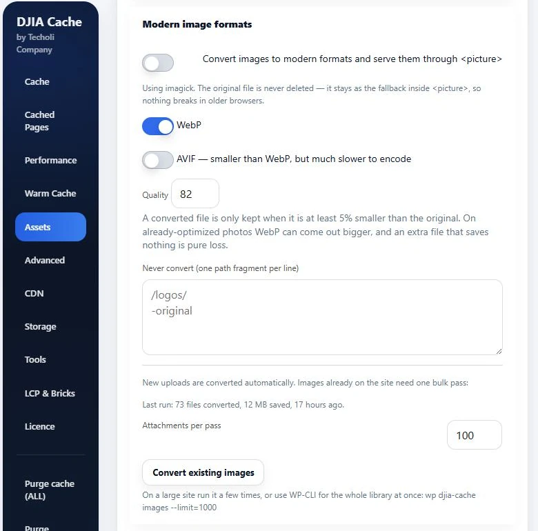
We ran Convert existing images in DJIA Cache (on the Assets tab, in the Modern image formats card). Over five passes it converted the media library to WebP: 184 attachments, 604 files, about 50 MB smaller in total. The new files sit next to the originals, which were not touched. For example, one 1.27 MB PNG on the home page had been sent to phones at full weight.
Step 13: Serve WebP without changing the markup
Our first attempt was the plugin’s Modern image formats setting, which serves the new files by wrapping each image in a <picture> element. But that changes the structure of the page. An image that was a direct child of a flex row is now inside a wrapper, so its percentage width refers to something else, and CSS rules written as .parent > img stop matching. As a result, the partner logos shrank to a few pixels. We switched it off five minutes later.
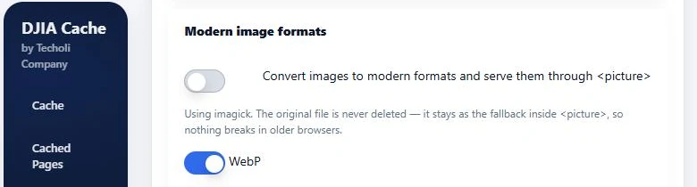
<picture> is off and WebP stays selected.The second attempt leaves the structure alone. Where a WebP version exists, the image address points to it, and a browser that cannot decode WebP falls back to the original file:
<img src="photo.jpg.webp"
     srcset="photo-768.jpg.webp 768w, photo.jpg.webp 1000w"
     onerror="useOriginal(this)">
We checked that 80 WebP addresses on the home and gallery pages respond correctly and that the layout with WebP images matches the layout with the originals. PageSpeed’s estimate of wasted image bytes on the home page fell from 1.7 MB to 0.2 MB.
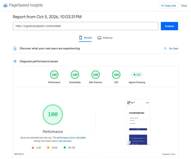
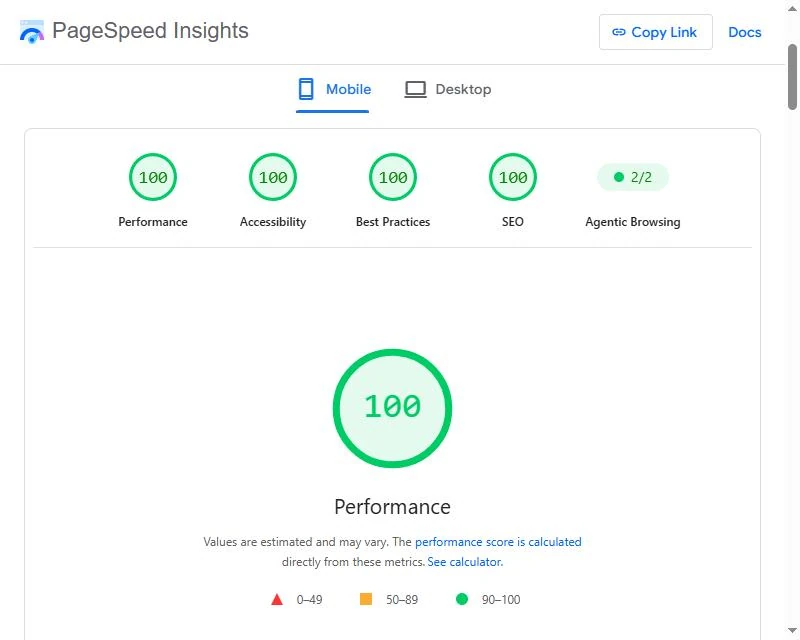
At this point three pages scored 100 on mobile and three scored 99: home, gallery and contact.
Step 14: Cut the fonts and the HTML down to what the site uses
The last point was in bytes that arrive before the main content. We found them in three places:
- Poppins arrived in seven files, about 52 KB, for a site that needs about 125 characters.
- The contact page downloaded 82 KB of Open Sans to draw the label of one button and whatever a visitor types into the form.
- The home page HTML was 22 KB after compression. A new connection delivers about 14.6 KB in its first round trip, so the browser had to wait for a second one before it had the whole page.
What we changed
- We made a subset of each font with only the characters the site uses: basic Latin, the Serbian letters and common punctuation. Five Poppins files now weigh 27 KB together. The Open Sans subset comes from Google Fonts itself, so it has the same hinting as the files the site already used: one 41 KB file that still carries every weight.
- The subsets are declared after the full fonts with a
unicode-range, so any other character still comes from the full file, as before. - We preload the subsets, so the browser starts fetching them with the HTML instead of after it has read the stylesheet.
- Bricks prints about 20 KB of page-specific CSS inside the HTML. We moved it to where the plugin’s Combined CSS bundle can pick it up and switched on Also absorb inline <style> blocks found in the page body.
- The animation plugin stores each element’s settings in an attribute on that element, 26 KB on the home page. They now travel in a small script file that loads together with the delayed scripts from step 9. The loader puts the settings back before the animations start. If that file fails to load, the content stays visible without animation.
- Gallery images got a correct
sizesvalue, so a desktop no longer downloads 1000-pixel images for slots that are 150 to 540 pixels wide.
This is one of the font rules:
@font-face {
  font-family: "Poppins";
  font-style: normal;
  font-weight: 400;
  font-display: swap;
  src: url(poppins-subset-400.woff2) format("woff2");
  unicode-range: U+0020-007E, U+00A0, U+00A9, U+00AB, U+00AE, U+00B0,
    U+00B7, U+00BB, U+00D7, U+0106-0107, U+010C-010D, U+0110-0111,
    U+0160-0161, U+017D-017E, U+2013-2014, U+2018-201A, U+201C-201E,
    U+2022, U+2026, U+20AC, U+2122;
}
How we checked it
Before deploying we checked that the regular weight of the Poppins subset draws text pixel for pixel like the full font, that moving the page CSS changes no computed style on any of the six pages, and that the new sizes values leave the gallery layout as it was. After deploying we confirmed that the animation settings come back unchanged and that the animation library picks the elements up.
Finally, the three pages that were at 99 went to 100. On the home page, the simulated phone now gets its first paint at 1.05 seconds and its main content at 1.5 seconds.
The DJIA Cache settings on this site
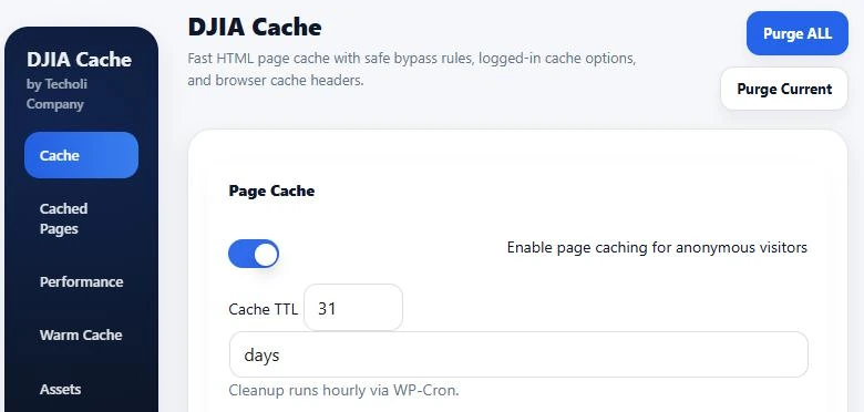
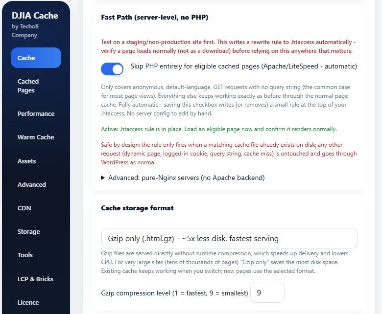
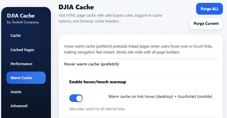
Steps 3, 12, 13 and 14 touched the caching plugin. These are the settings screens of DJIA Cache on this site as they are now. The screens for the CSS bundle and the image formats are in steps 3, 12 and 13.
What is switched on
The table lists what is switched on under the names the plugin uses, in the order of its tabs (Cache, Performance, Warm Cache, Assets, Advanced), and says which settings we changed.
| Module | Setting on this site |
|---|---|
| Page Cache | On for anonymous visitors. Cache TTL 31 days. |
| Fast Path (server-level, no PHP) | On. The plugin’s .htaccess rule is in place, so eligible cached pages are served without starting PHP. |
| Cache storage format | Gzip only (.html.gz), compression level 9. |
| Object Cache | On (file-based drop-in). |
| Builder global styles | On. The cache is purged when the builder’s global styles change. |
| Browser Cache Headers | On. HTML for 60 seconds, assets for one year. |
| WordPress Feature Optimization | Disable emoji scripts and styles: on. Switched on in step 3. |
| Instant Navigation (Speculation Rules) | On. Mode Prefetch (lighter), Eagerness Moderate. Eagerness was Immediate before step 3. |
| Hover warm cache (prefetch) | Enable hover/touch warmup: on, for all internal links. |
| Static Asset Caching | On, one year, with the immutable directive. |
| JavaScript Optimization | Add defer to enqueued scripts: on. |
| CSS Optimization: Combined CSS bundle | Combine local CSS files into one shared bundle, Preload generated CSS bundle and Also absorb inline <style> blocks found in the page body: on. We switched on the first in step 3 and the third in step 14. |
| Minification | Minify HTML, Minify CSS files and Minify JS files: on. |
| Extra Optimizations | Add font-display: swap to Google Fonts and Add image width/height + lazy-load: on. |
| Modern image formats | WebP on, Quality 82. Existing images converted in step 12. The <picture> switch is off (see below). |
| Cache Preload | Enable cache preloading: on, with Rebuild whole site. |
| Cron Jobs | Cache cleanup (hourly) and Scheduled preload (every minute): on. |
What we left off, and why
- Modern image formats, Convert images to modern formats and serve them through
<picture>: off. The wrapper broke the logo rows (step 13). - Auto-generate Critical CSS and Delay CSS loading (non-blocking): off. The generated CSS did not cover the page (see below).
- Enable Delay JS (HTML rewrite): off. On this site the loader from step 9 does that job.
- Preload first fonts (woff2) and Self-host Google Fonts CSS: off. The child theme does both (step 4). The plugin’s font preload was on at the start; we switched it off so fonts are not preloaded twice.
What did not work
Automatically generated critical CSS looked like the obvious way to stop the stylesheet from blocking the first paint. We generated it, loaded the page with only that CSS, and compared it with the fully styled page. However, thousands of style values differed, which a visitor would see as a flash of half-styled content. We switched it off within seconds and left the stylesheet blocking.
Results
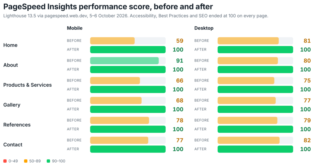
Every page now scores 100 for performance, accessibility, best practices and SEO, on mobile and on desktop. PageSpeed scores move by a point or two between runs, so a page at 100 can show 99 on the next one.
This is the mobile performance score of each page at the points where we measured it:
| Page | Start | After step 9 | After step 11 | After step 13 | After step 14 |
|---|---|---|---|---|---|
| Home | 59 | 98 | – | 99 | 100 |
| About | 91 | 99 | – | 100 | 100 |
| Products & Services | 66 | 95 | 99 | 100 | 100 |
| Gallery | 68 | 89 | 99 | 99 | 100 |
| References | 78 | 94 | 100 | 100 | 100 |
| Contact | 77 | 100 | – | 99 | 100 |
A dash means the page was not measured at that point.
For visitors, the change is that the home page shows its content on a slow phone connection in a second and a half instead of ten, and nothing jumps while it loads.
If you want to try this on your own site
- Measure every page on mobile and desktop before you start, and again after each change.
- Compare computed styles before and after instead of trusting your eyes.
- Look at what a phone downloads that it never shows.
- Check which fonts, characters and icons you ship against which ones you use.
- When a tool rewrites your markup, test the pages whose layout depends on that markup.
Need a site that loads like this?Get started